UI Design for Directo
Employer: Directo • Timeline: 2016–2019 • Role: Sole UI designer
Directo is a B2B SaaS which offers an all-in-one solution for running a business, from invoices to inventory management and HR functionalities. It is widely used in Estonia and has also branched out to Latvia, Lithuania and Finland.
Their UI was outdated and they needed a redesign for their user interface in order to look more professional and appealing for new potential clients and also for the design to be responsive on smartphones and tablets.
I was hired to work on that, so I created a new visual style from scratch, a design system to document it and redesigned some of the most important views of the software. I also did a bit of user research to make sure I’m going in the right direction. I also did some coding - my CSS was used in the live product and the rest of the design was implemented by developers following my HTML prototypes.
Project included:
UI design
User research
Wireframing
Mockups
HTML/CSS Prototypes
Component Library
Technologies used:
HTML
CSS
Sketch app
Git
Airtable
Typeform
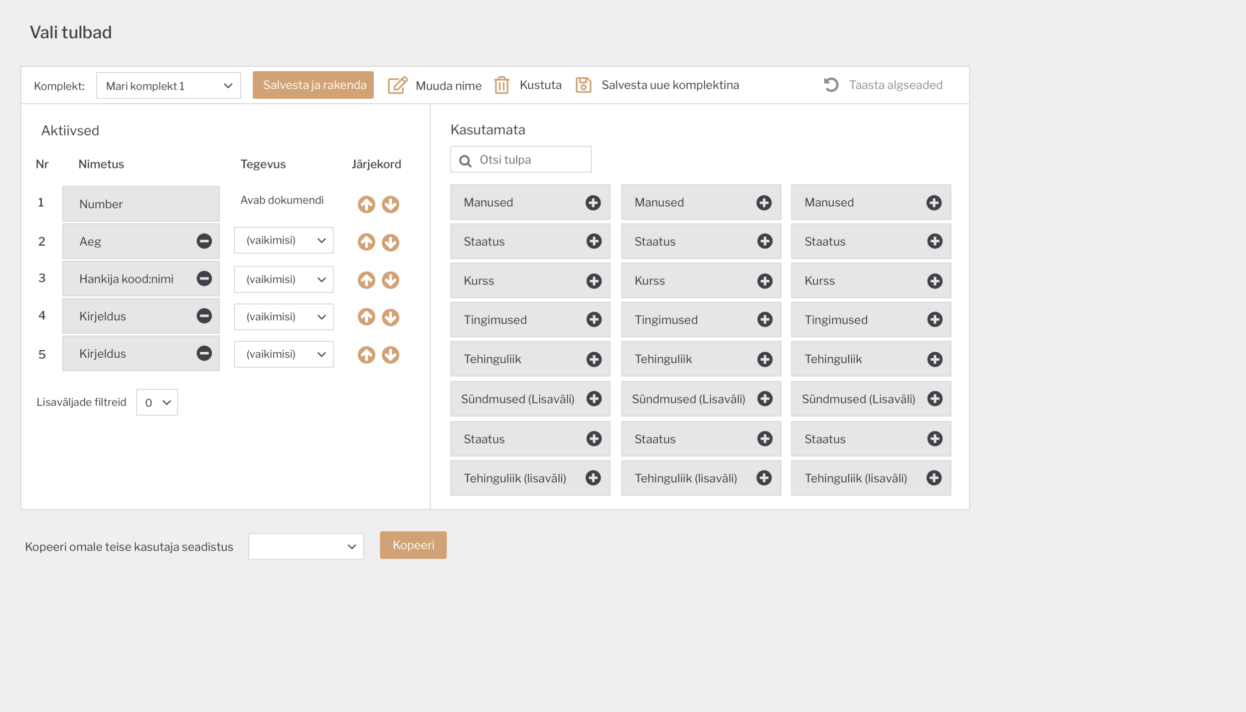
Design System
I developed a new design language from scratch and created a component library + style guide to communicate the changes. I built the component library myself as an HTML/CSS website. With these guidelines, engineers could make smaller style updates without my help and it would be easier to other designers in the future.
User Research
I tried to gather as much information as possible about the requirements and any user pain points I could help resolve with the redesign. During my time working there I used the following research methods:
User interviews
User testing
Field observations
“Biggest Issue Bucket” survey
Regular survey
Stakeholder meetings
“20 second gut test”
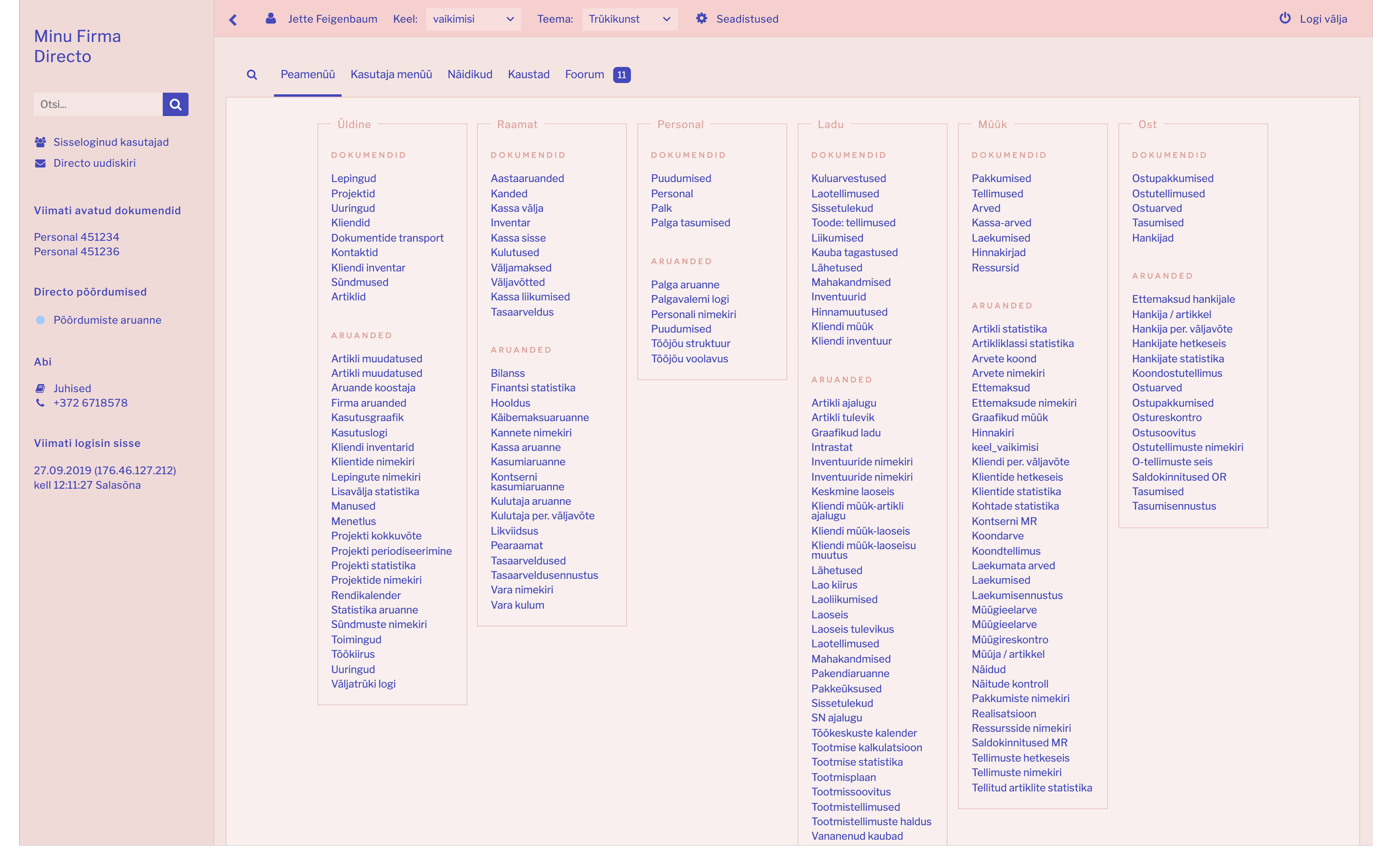
The New User Interface
After defining the new design language, I redesigned the main dashboard, list view with configuration, inventory item view, advanced search functionality, settings pages and more. Not only did I define the designs but also created responsive CSS and HTML prototypes of the designs. My CSS went live directly and the HTML was used by developers to build the designs in the live app.


Process
Over time I developed a process that I could use for every new page or part of the app I was assigned to redesign.
1. Research
In this stage I tried to understand the functionality, users and pain points. The questions I asked were:
What does this page do?
Who is using this page the most? How does this help them with their work?
Any existing pain points I could improve with the redesign?
2. Wireframes + Mockups
I started with brainstorming possible layouts on paper. After having decided on the direction, moved to Sketch app to put together high-fidelity mockups.
3. Feedback
I gathered feedback from people in the company that were experts on that particular functionality or part of the app, sometimes presented the new design to stakeholders and developers in our weekly meetings. Based on the feedback I would iterate and do necessary changes.
4. Prototype
When the mockups were approved, I created a responsive HTML + CSS prototype.
5. Handoff
I forwarded my prototype to the developer who was assigned to implement the new design in the app, so that he could start working on it.
Color Themes
At one point I found out that many users were logged into different company accounts at the same time with multiple windows open. To help users distinguish between the accounts, I developed multiple color themes that they could use to personalise their experience. I was also asked to design themes to celebrate Estonian, Latvian and Lithuanian 100th anniversaries.